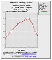
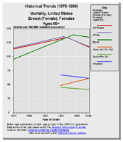
Historical Trends Graph
Purpose:
Use this graph to explore the relationship over time of levels and trends in cancer rates for geographic areas and for demographic subgroups.
While useful for planning and evaluating cancer control, these trends represent an ecological analysis. An cancer epidemiologist knowledgeable about the area and its demographics and health resource utilization should assist in interpreting unexpected trends.
Cancer statistics require careful interpretation. See the information page about interpret rankings for insight into interpreting cancer statistics particularly if you are a new user of cancer statistics.
The Quick Reference Guide provides an introduction to the interactive features of this graph.
Data Sources:
- Mortality data are provided by the National Vital Statistics System
 at the National Center for Health Statistics of the Centers for Disease Control and Prevention.
 - Incidence data are provided by the National Program of Cancer Registries Cancer Surveillance System (NPCR-CSS), Centers for Disease Control and Prevention and by the National Cancer Institute's Surveillance, Epidemiology, and End Results (SEER) Program.
- Population counts for denominators are based on Census populations as modified by NCI.
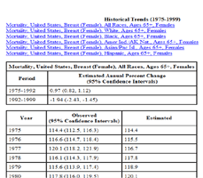
- Trends are determined by using Joinpoint analysis.
- Rates are calculated using SEER*Stat.
- Trends are determined by using Joinpoint analysis of available historical data and reporting the last segment as the most recent trend.