Rate/Trend Comparison Table
Purpose:
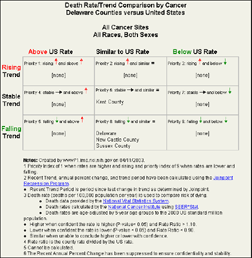
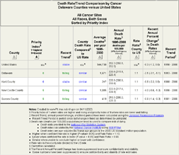
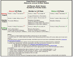
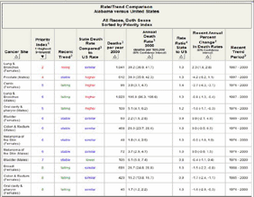
Compares cancer rate changes between a county of a state and the entire state or between a state and the US. The graphic version of this table groups the data so you can see quickly if the trends are rising, falling, or remaining stable and how they compare to the selected comparison rates. Cancers that need more attention (have rising rates that are higher than the rate used for comparison) are in the top left, reddish square and are marked by a magnifying glass. Cancers that are doing the best (have falling rates that are lower than the rate used for comparison) are in the bottom right, dark green square and are marked by an apple. The non-graphical version of this table gives you the actual rates and well as the annual percentage changes as well as their 95% confidence intervals.
Rate/Trend Comparison Table by State/County
This table shows major cancer sites, rates, and trends for a user specified county compared to the entire state or for a user specified state compared to the US based on data from the National Center for Heath Statistics .
.
Rate/Trend Comparison Table by Cancer
This table shows the county rates and trends compared to the overall state rate or to the overall US rate based on data from the National Center for Heath Statistics.