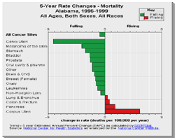
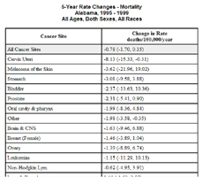
5-Year Rate Changes Graph
Purpose:
This graph provides a quick look at which cancer sites have rising rates and which have falling rates over the most recent 5 years of data. The goal is for every cancer site to have falling mortality. Incidence is a more complex story that requires local knowledge and interpretation. For example, a successful screening program will result in a short term rise in incidence. The Historical Trends graph can be used to look at the trends in rates. The last 5 year AAPC is generated from a historical trend from 1990.
Cancer statistics require careful interpretation. See the information page about interpret rankings for insight into interpreting cancer statistics particularly if you are a new user of cancer statistics.
Note that a modest percent change in a more common cancer such as lung cancer will have a greater impact on the overall cancer burden than a larger percent change in a more rare cancer.
The average annual percent change can be applied to either the rate or to the count in order to provide a rough estimate for planning purposes. For example, if the annual percent change is minus 1% and there are 500 deaths per year then it can be estimated that there will be 5 fewer deaths next year assuming the trend continues. Like compound interest, more accurate estimates require more sophisticated methods and work is in process to provide projections.
The Quick Reference Guide provides an introduction to the interactive features of this graph.
Data Sources:
- Mortality data are provided by the National Vital Statistics System
 at the National Center for Health Statistics of the Centers for Disease Control and Prevention.
 - Incidence data are provided by the National Program of Cancer Registries Cancer Surveillance System (NPCR-CSS), Centers for Disease Control and Prevention and by the National Cancer Institute's Surveillance, Epidemiology, and End Results (SEER) Program.
- Population counts for denominators are based on Census populations as modified by NCI.
- 5-year Average Annual Percent Change (AAPC)s are calculated by the Joinpoint Regression Program and are based on annual percent changes (APCs). Where not enough years of data are available, Expected Annual Percent Change (EAPC) is calculated using SEER*Stat.